Paid
Strategically placed paid advertisements that point the consumer back to the product.
Out-of-home
One billboard and two bus shelters that put The Small Shell in front of people on the move.
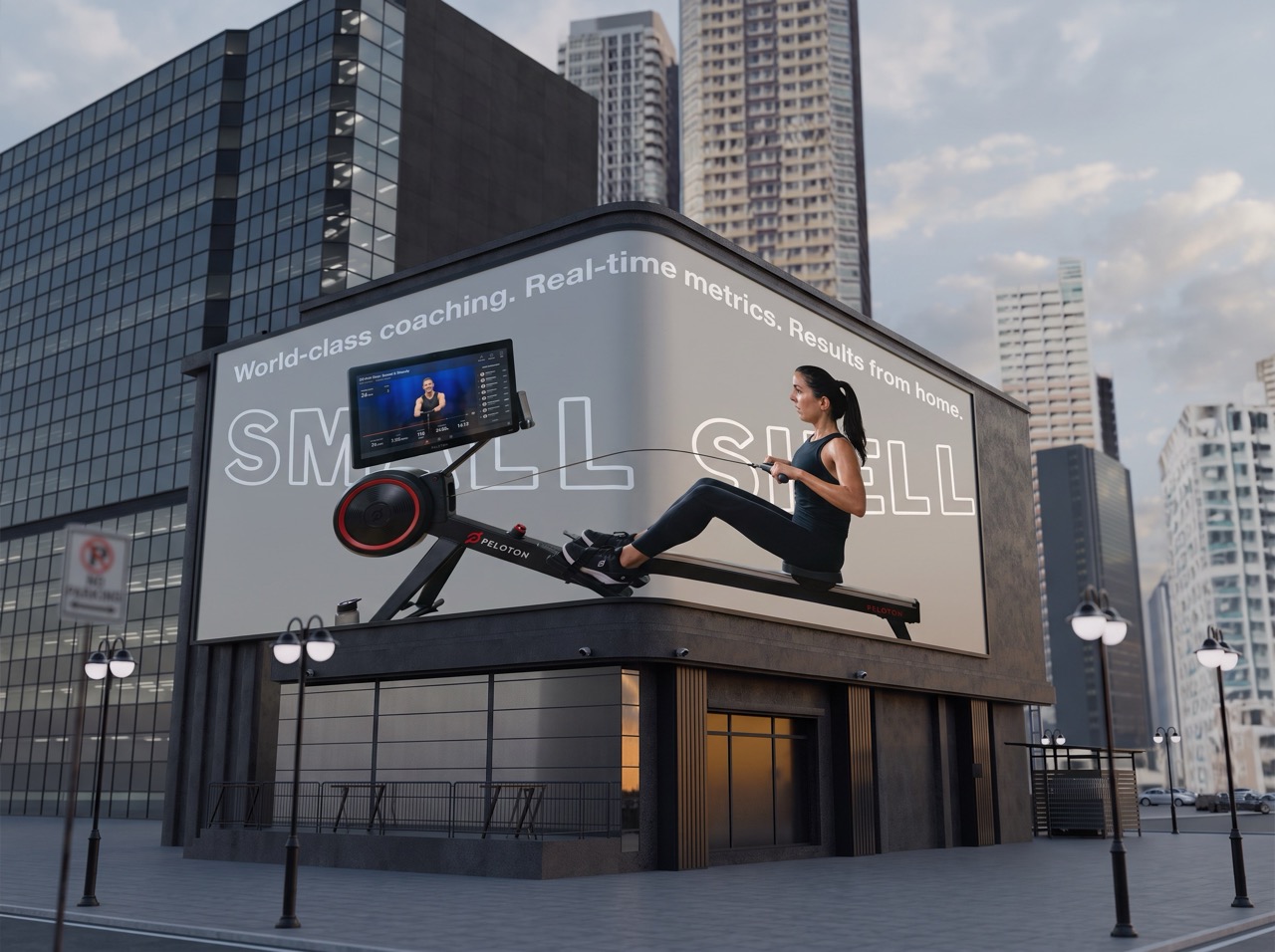
Posted in high-traffic downtown business districts, this billboard targets professionals seeking premium at-home fitness solutions. This billboard placement seeks to emphasize world-class coaching and performance benefits without needing a gym membership.
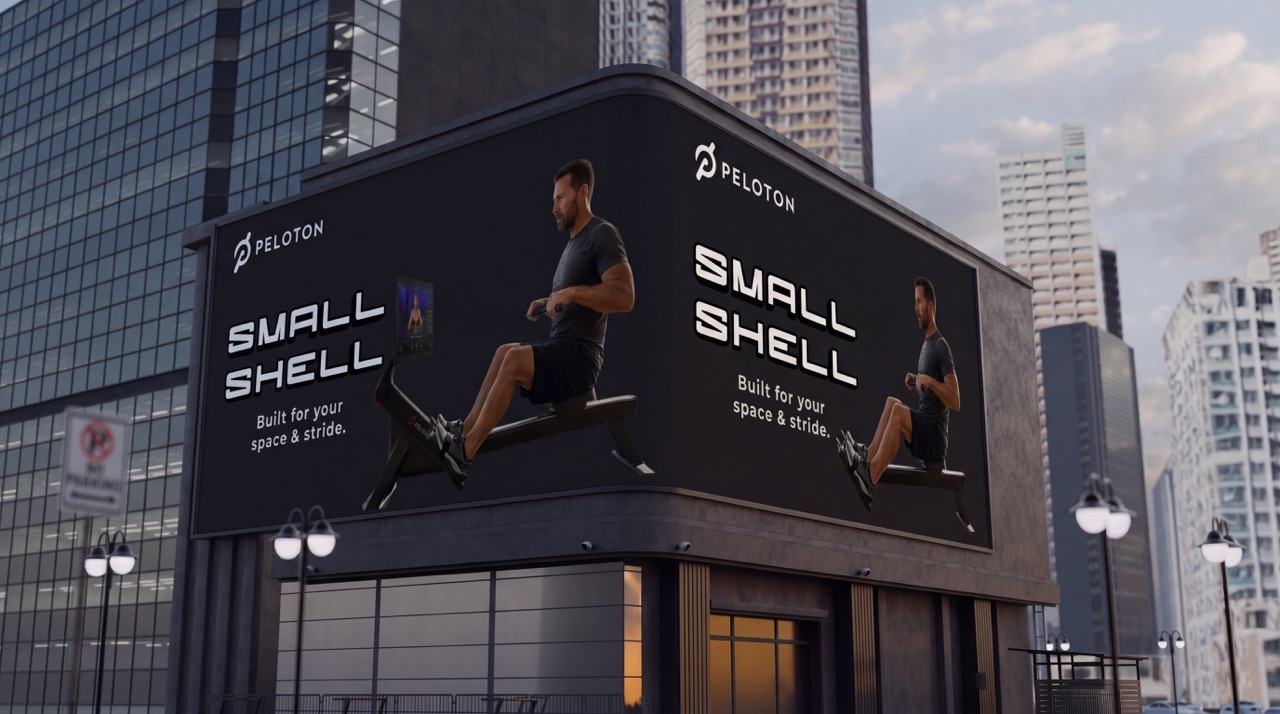
This billboard champions the sleek designs of the Small Shell rowin machine, emphasizing the functionality of the design. Placed in highly trafficked downtown centers, this billboard reaches beyond the confines of what Peloton is “known” for in relation to cycling, and into the space of functional rowing equipment.
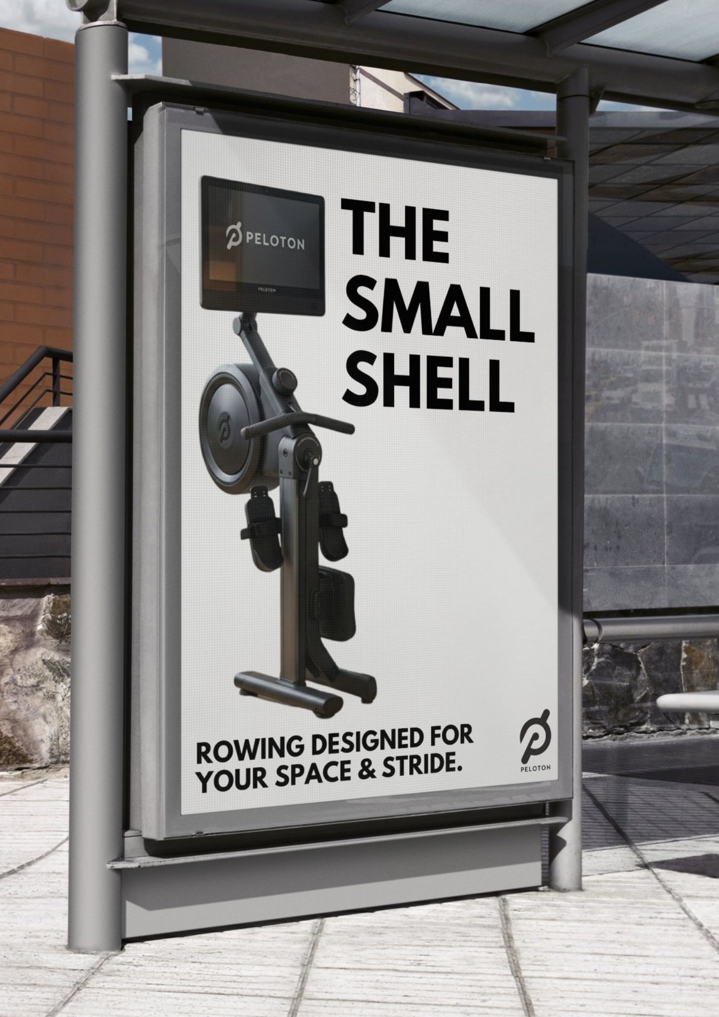
Placed at urban bus shelters in dense residential neighborhoods. This ad highlights Peloton’s compact Small Shell footprint, appealing to commuters living in apartments or homes with limited space.
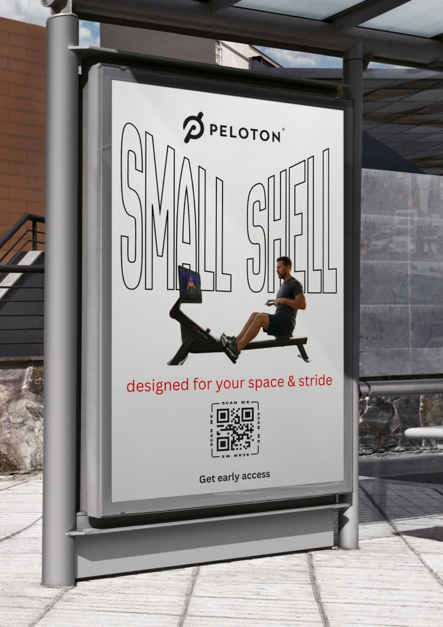
Located near transit hubs, shopping districts, or fitness centers, this ad encourages busy passersby to scan for early access and learn how Peloton Small Shell can easily fit into their everyday life and smaller spaces.
Creative brief
The strategy and direction behind every paid placement. Replace each underlined placeholder with your own brief.
Designed for your space and stride.
To promote the launch of Peloton’s “Small Shell” premium compact rowing machine as the first of it’s kind. Built to expand Peloton’s current fitness consumer ecosystem beyond cycling or traditional rowing, and break into the at home rowing machines with a premium new product.
Primary: Urban professionals ages 20-40 years old. Fitness-minded consumers who are living in apartments or other small spaces.
Consumers who desire high-quality gym equipment without sacrificing valuable living space. As well as users who increasingly seek connected fitness activities that provide motivation, coaching, and broader community engagement.
Motivating, empowering, confidence building, premium.
Sleek designs that align with the brand’s overall identity and standard designs. Use of key colors such as red, white, black, and grey.
Digital (Instagram, TikTok, Peloton Application, Programmatic Display Ads), Owned (Webpage, Email marketing campaigns, Blog Postings, In-App notifications), OOH (Bus Shelters, Billboards, Apartment complex media placements, Fitness/wellness events)
“Get early access”; “Designed for your space & stride”; “World-class coaching. Real-time metrics. Results from home”; “Start your first row today.”
Pre-order purchase volumes. Webpage engagement/traffic as well as product page engagements. Increased application downloads and participation. Consumer consideration/intent-to-purchase metrics tracked through the webpage cart. [Add targets]
40% digital media; 20% content creation; 20% OOH advertisements; 10% influencer partnerships; 10% PR & experience marketing. ·
Peloton Logo. Consistency in the use of colors. Compact design and space-saving benefits. Consistent CTA across entire campaign. Inclusion of legal disclaimers as well as product specifications.